Reading Time: 3 minutes
You’ve probably noticed, over the last year pop-ups have been appearing on ecommerce sites all over the web. Some have introductory offers, some offer a newsletter sign up and some offer personalised promotional codes. Pop-ups have made it on to many ‘2016 trend’ blogs and have already been implemented by many online stores. So, do they actually work?
The purpose of a pop-up.
Pop-ups are used for two main reasons:
1. To capture data
2. To encourage a conversion
The average ecommerce site has a 3% conversion rate, that means out of every 1,000 visitors you receive 970 will exit the site without making a purchase and likely without logging in/registering. That’s 970 potential customers, a proportion of which you may have earned through paid media, lost without trace. This has been, and will continue to be, the largest problem facing ecommerce retailers today – how do you convert more customers?
Re-engagement.
To answer that question, we have to look at the most successful re-engagement strategy. As marketers, we know that email marketing can be highly successful as a channel. Abandoned cart emails, for example, have been shown to achieve an average of 47% open rate and a 5% conversion rate (Remarkety). That’s 5% more sales that had been lost, all by sending an automated mailer. With 58% of adults checking their email first thing in the morning (Customer Intelligence), this channel is clearly an excellent way to reaching out to your customer base and I firmly believe it will never be ‘dead’.
Data acquisition.
So, we have website traffic and a re-engagement strategy, but how do we acquire the email address? This is where the pop-up comes in. Like them or loathe them, recent studies have shown how successful the implementation of a pop-up can be. Data from one study revealed a 1375% increase in email sign-ups when comparing a pop-up with a sidebar form. Another study based on SkinnyMe Tea found the company increased email opt ins by 758% after implementing an on-site pop-up. By offering a discount code on site, SkinnyMe Tea was able to increase their sales conversion rate by a full 1%.
Quite simply, if you can encourage website visitors to hand over their email address (often for something in return such as a discount code), you open up a vast opportunity for re-engagement if they decide not to make a purchase at that time. If a pop-up enables you to do this, I say it’s definitely worth testing out!
Types of pop-up.
Promotional.
A promotional pop-up is most often used after a visitor spends a certain amount of time on the site. These pop-ups offer a discount in exchange for an email address. Top tip: if you’re using this type of pop-up, ensure you have a system that is sophisticated enough to recognise visitors. You don’t want to be showing one of your VIP customers ‘10% off when you sign up’, for example.
Newsletter.
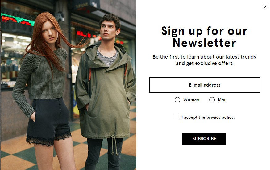
The incentive behind this type of pop-up is content. If you produce engaging content, you can incentivise your visitors to reveal their email address by offering the latest news, trends, events etc. This type of pop-up works extremely well with lifestyle-led brands.
Site exit.
A site exit pop-up tends to focus on on-site conversions at that time. You may wish to promote a time-based offer such as ‘Free Delivery Today Only!’ or ‘You still have items in your basket – Here’s 10% off!’. There is a temptation with site exit pop-ups to forgo the email field and simply present a promotional code for the visitor to use there and then – remember that the goal here is to collect data as well as encourage promotions so I’d urge you to always use gated promotional codes.
Finally, and arguably most importantly – don’t throw design out of the window.
A pop-up is, for lack of better words, an intrusion in a customer’s user journey. Whilst this can be seen as a positive thing (when discounts are offered), it is vital that customers feel they are still engaging with the same brand and website at all times. This is why pop-up design should be extremely brand-led. If the design is disjointed, the pop-up will simply look like spam and visitors may just abandon the whole site. I urge you to run A/B tests to find what works best for your customers.
Pop-ups will never be for everyone.
Whilst there are some fantastic stats around the success of pop-ups, it all comes down to your customer base which is why testing is so important. If you have decided to go ahead with an on-site pop-up do your research, understand your customers and run a test on a controlled segment. Here are a few things to consider:
1. Always, always, always give the visitor the option to close the pop-up (and make it clear where to click)
2. Have a different strategy for mobile. Pop-ups can work on mobile, however, I’d recommend reviewing the design and animation to offer a more streamlined approach
3. No clunky pop-ups, please. Ensure your solution doesn’t impact the rest of your site’s load speed
4. Analytics will lead the way. Testing is all about data, collect this data by using click tracking – run your test and compare results at the end. How many visitors completed the goal? How many dismissed the pop-up?


